Ever seen a sign where one tiny spacing mistake turns “Click Here” into… something very not safe for work? The internet roasts those design fails for being hilarious—but in medicine, the same kind of spacing slip can be deadly, not meme-worthy.
Inspired by those viral “bad spacing” design posts trending right now, we’re taking that exact energy into the exam room. Because if botched kerning can wreck a brand, bad charting can wreck a life—and trigger a medical malpractice case that makes headlines.
Let’s break down real-world case study vibes through the lens of one super simple idea: when what’s written isn’t what’s meant.
Tiny Text, Huge Trouble: When One Digit Changes Everything
Online, a misplaced space can turn “100% off” into “10 0% off” and confuse everyone. In medicine? Swap one digit in a dosage, and you’re staring at a med mal landmine.
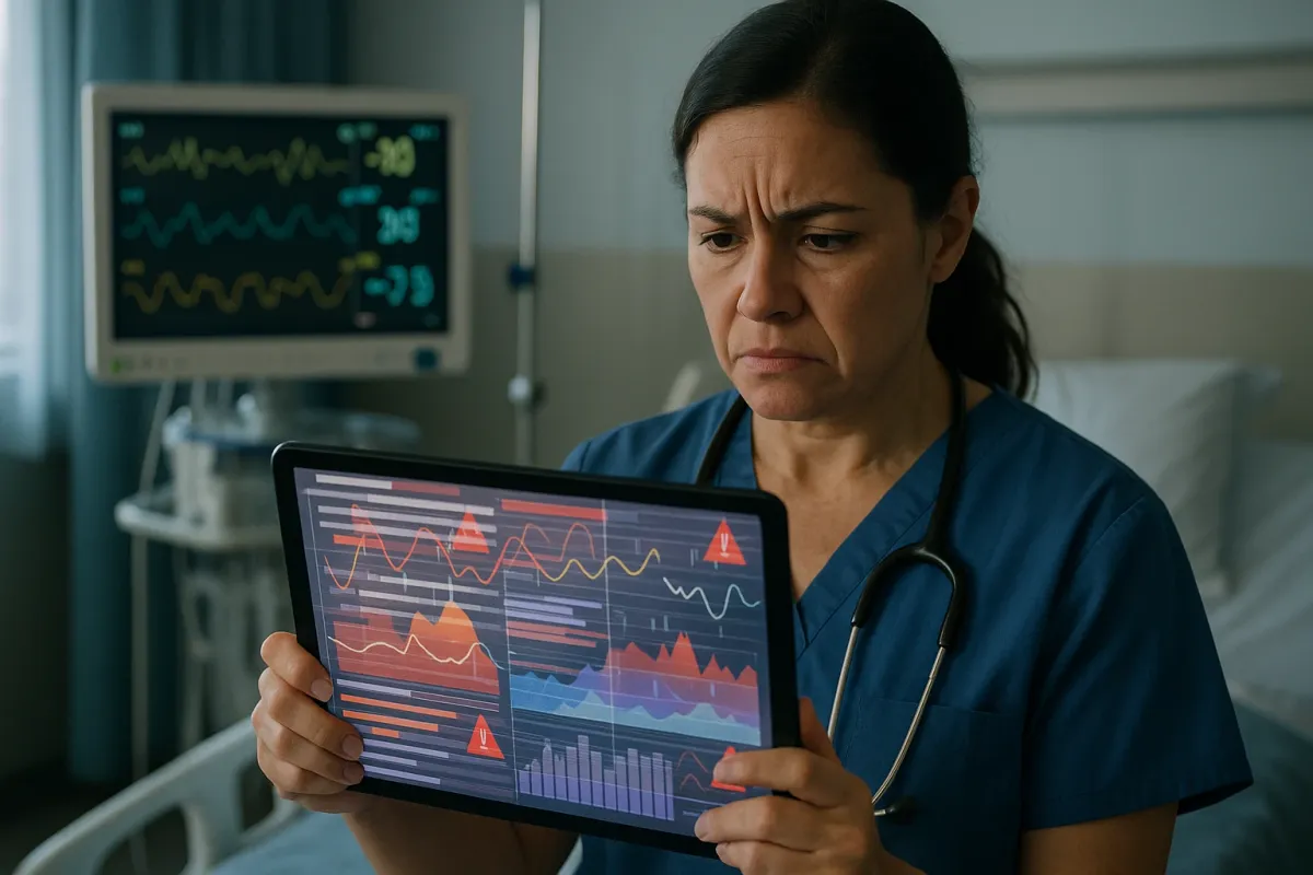
Picture this classic pattern from real malpractice case files:
A doctor scribbles “10.0 mg” instead of “1.0 mg.” The decimal is basically invisible on a rushed chart. The nurse reads “10 mg,” gives the full dose, and the patient tanks. The hospital later argues “it was just a documentation error.” The plaintiff’s lawyer calls it what it is: a breach of the standard of care—the kind juries understand instantly.
This is why modern hospitals obsess over computerized order entry, alerts, and standardized dosing. If your medical chart or portal shows a dosage that looks off by a factor of 10? Screenshot it. Ask. Clarify. That “this looks weird” moment can be the difference between a scare and a catastrophe—and it becomes gold evidence if a case ever hits court.
The “Missing Word” Problem: When Notes Leave Out the One Thing That Matters
Those design memes where a missing space turns “Kids Exchange” into “Kid Sexchange”? Disturbing, yes—but the structure of the fail is very familiar in med mal.
In charting, one missing word—“no”—can flip the story of your entire care. Think about a case study scenario that pops up in litigation again and again:
- The patient tells the triage nurse: “I have chest pain and shortness of breath.”
- The nurse types: “No chest pain, reports shortness of breath.”
- The doctor skims the chart, sees “No chest pain,” assumes low cardiac risk.
- Hours later, the patient has a massive heart attack.
At trial, the hospital points to the record: “The chart says no chest pain.” The patient swears they reported it. Suddenly, it’s a credibility war—you vs. the EHR.
If you’re navigating a complex medical issue right now, here’s your move:
After big visits (ER trips, new diagnoses, major changes), log into your patient portal and read exactly how your symptoms were documented. If something major is wrong, message the office in writing: “Just confirming that I did report X symptom.” That creates a time-stamped trail that can support you later if care goes off the rails.
Copy-Paste Chaos: When Yesterday’s Body Becomes Today’s Lawsuit
In design, lazy copy-paste leads to those horrendous signs where the placeholder text never got replaced. You laugh, you screenshot, you share. In medicine, copy-paste looks like this:
A doctor follows you in the hospital for four days. Each day’s note is a clone of the last:
“Patient resting comfortably, no complaints, abdomen soft, non-tender.”
Meanwhile, your appendix is silently rupturing, your pain is off the charts, and the nurse has called the doctor three times.
Malpractice attorneys love this pattern because it screams “no actual exam performed”. When copy-paste goes too far, it documents a fake reality—and juries are not kind about it.
If your hospital or clinic notes read like time-looped deja vu, that’s a red flag. You’re allowed to say:
- “Can you walk me through what you’re writing?”
- “Can you add that my pain is now 9/10 and different from yesterday?”
Those small pushes break the copy-paste spell and can later show that you tried to get your worsening condition taken seriously.
The One-Line Comment That Can Make or Break Your Case
Those “cursed comments” threads online are all about short, unhinged remarks that change the whole vibe of a post. In medical records, a single throwaway line can do the exact same thing—except instead of dark humor, it can tank or turbocharge a lawsuit.
Case pattern that’s trending in real verdicts:
A doctor writes, “Patient is anxious, focused on symptoms, difficult historian.” Later, the same patient is diagnosed with advanced cancer that should’ve been caught earlier. Defense tries to blame “non-specific complaints” and “vague symptoms.” Plaintiff’s team flips that one judgmental line into Exhibit A of bias and dismissal.
On the flip side, a nurse’s note like, “Patient repeatedly requested CT scan and reports worsening severe pain; MD notified at 19:30” can be the smoking gun that saves the case, showing the system—not the patient—failed.
If you’re chronically ill or dealing with a complex diagnosis, assume every interaction could end up in your record—for better or worse. Be clear, be consistent, and when care feels dismissive, consider sending a calm, factual follow-up message summarizing what happened. That written clarity can become your built-in fact-checker down the road.
When Design Rules Become Legal Rules: The New Standard of Care
Those viral posts about spacing and legibility in design highlight one big truth: If people can’t read it, it doesn’t work. Courts are starting to say the same about medical records.
Emerging trends in actual lawsuits and safety policies:
- Hospitals are getting called out for illegible, cluttered, or confusing charts that make communication breakdowns inevitable.
- “Human factors” experts are being brought into trials to explain how poorly designed software screens, microscopic fonts, and bad layout literally set clinicians up to fail.
- Attorneys are no longer just asking “What did the doctor do?” but also “What did the system look like on their screen when they clicked that button?”
This matters for you, right now, because your health data is living inside these designs. If your portal is confusing, if lab results are buried, if discharge instructions are a mess—that’s not just annoying. It’s potentially evidence of a system defect, not a personal failure, if something goes wrong.
When things feel unclear:
- Ask: “Can you show me on the screen where that’s documented?”
- Request: “Can I have my visit summary in plain language before I leave?”
- Save: Screenshots, printouts, and messages. In a med mal case, foggy UX suddenly becomes very sharp proof.
Conclusion
The same tiny spacing tweaks that turn ad copy into internet comedy can, in medicine, turn harmless into harmful and confusion into catastrophe. Behind every viral design fail is a simple lesson for healthcare: what we write, how we space it, and how people read it absolutely matters.
If you’re living through a serious medical issue right now, don’t just focus on what your providers say—pay attention to what they write. Your chart isn’t just paperwork; it’s your story, your receipts, and your shield if the system ever breaks around you.
And if this hit a nerve? Share it. The more patients, families, and even clinicians wake up to the power of “tiny text, huge consequences,” the closer we get to a world where the only spacing fails we laugh at are on storefront signs—not in surgical notes.
Key Takeaway
The most important thing to remember from this article is that this information can change how you think about Case Studies.